Wanna show off your Sig/Avatar/artwork. Well this is the place to do it!
-
MoDFox
- Posts: 1293
- Joined: Wed Aug 03, 2005 5:01 pm
- Location: Ontario, Canada.
Post
by MoDFox »
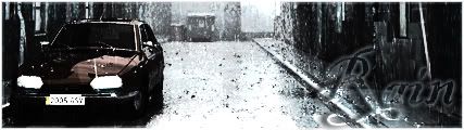
This is more of a step-by-step thing, but I thought if I laid it out like this I could get some input on what to add where.
Here it goes.
(original Render).

(Images removed for slower nets!)
V4.

V5.

V6(Border).

Just looking for some feedback / Input on this. Thanks!

Last edited by
MoDFox on Fri Jan 18, 2008 10:06 pm, edited 1 time in total.
-
halobuddha
- Posts: 834
- Joined: Fri Oct 07, 2005 4:46 pm
- Location: running around like a chicken w/o a head
Post
by halobuddha »
4 by far!! love the colors on 4
-
Aumaan Anubis
- Posts: 2938
- Joined: Fri Jun 30, 2006 1:01 pm
- Location: Aumaan
-
Contact:
Post
by Aumaan Anubis »
Yeah, I don't think you should've taken out that blue in #4, but it all looks pretty good.

Tural wrote:MrMurder, we're going to hold you to that promise.
It is expected, and demanded.
-
Dr.Cox
- Posts: 4027
- Joined: Fri Jun 24, 2005 5:48 pm
- Location: Beaverton, Oregon.
-
Contact:
Post
by Dr.Cox »
Make the C4d Smaller so it isnt cut off.

Not removing this 'till I get back. Leaving on [01/05/09]
-
MoDFox
- Posts: 1293
- Joined: Wed Aug 03, 2005 5:01 pm
- Location: Ontario, Canada.
Post
by MoDFox »
Thanks for all the feedback! Also, Cox, it may be a bit tough to do that, the render doesn't size down too well But I will try.
-
bcnipod
- Posts: 3580
- Joined: Tue May 15, 2007 8:52 am
- Location: 45 Minutes outside Boston
-
Contact:
Post
by bcnipod »
i agree number 4 is the best of the 5.
-
Dr.Cox
- Posts: 4027
- Joined: Fri Jun 24, 2005 5:48 pm
- Location: Beaverton, Oregon.
-
Contact:
Post
by Dr.Cox »
MoDFox wrote:Thanks for all the feedback! Also, Cox, it may be a bit tough to do that, the render doesn't size down too well But I will try.
Well find a new render OR slap a border on there.
Not removing this 'till I get back. Leaving on [01/05/09]
-
Dsoup
- Posts: 599
- Joined: Sun Jan 07, 2007 5:40 pm
- Location: Sacramento, California
Post
by Dsoup »
Yeah, it's just a plain old C4D in an ugly position.
-
Dr.Cox
- Posts: 4027
- Joined: Fri Jun 24, 2005 5:48 pm
- Location: Beaverton, Oregon.
-
Contact:
Post
by Dr.Cox »
On further inspection, the render is terribly rendered (Cut out) =3
Not removing this 'till I get back. Leaving on [01/05/09]
-
xlRainlx
- Posts: 852
- Joined: Thu Oct 05, 2006 8:30 pm
- Location: Spirit of Fire Gamertag: Mal Vulcan
-
Contact:
Post
by xlRainlx »
Still looks very sexy though. <3 9/10
-
Cobain
- Posts: 688
- Joined: Fri Jan 11, 2008 9:09 pm
- Location: To what?
-
Contact:
Post
by Cobain »
halobuddha wrote:4 by far!! love the colors on 4
-
MoDFox
- Posts: 1293
- Joined: Wed Aug 03, 2005 5:01 pm
- Location: Ontario, Canada.
Post
by MoDFox »
Dr.Cox wrote:On further inspection, the render is terribly rendered (Cut out) =3
Don't know how that works considering its perfectly cut along the edges.

Ha, but yea it looks a bit rough due to some of the extra colours and stuff.
-
Aumaan Anubis
- Posts: 2938
- Joined: Fri Jun 30, 2006 1:01 pm
- Location: Aumaan
-
Contact:
Post
by Aumaan Anubis »
V6 FTW!
Tural wrote:MrMurder, we're going to hold you to that promise.
It is expected, and demanded.
-
V0Lt4Ge
- Posts: 3602
- Joined: Wed May 12, 2004 4:56 pm
- Location: California
-
Contact:
Post
by V0Lt4Ge »
Version 6. I like borders.
-
halobuddha
- Posts: 834
- Joined: Fri Oct 07, 2005 4:46 pm
- Location: running around like a chicken w/o a head
Post
by halobuddha »
did i say 4? haha i meant six
-
RaVNzCRoFT
- Posts: 6208
- Joined: Mon Jan 10, 2005 3:05 pm
- Location: Raleigh, North Carolina, USA
Post
by RaVNzCRoFT »
It reminds me of the Photoshop feather logo.
-
Cobain
- Posts: 688
- Joined: Fri Jan 11, 2008 9:09 pm
- Location: To what?
-
Contact:
Post
by Cobain »
halobuddha wrote:did i say 4? haha i meant six
-
bcnipod
- Posts: 3580
- Joined: Tue May 15, 2007 8:52 am
- Location: 45 Minutes outside Boston
-
Contact:
Post
by bcnipod »
RaVNzCRoFT wrote:It reminds me of the Photoshop feather logo.
it does, also i am thinking i like the one without a border. to me it looks confined with the border on it.
-
Kirk
- Posts: 6031
- Joined: Wed Jan 21, 2004 10:54 pm
- Location: Alaska
Post
by Kirk »
RaVNzCRoFT wrote:It reminds me of the Photoshop feather logo.
Took words right out of my mouth. I was thinking that the first time I saw it awhile ago..


