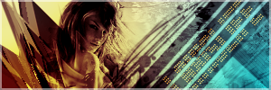
2nd Vector Sig
- CabooseJr
- Posts: 4592
- Joined: Wed May 11, 2005 8:09 am
- Location: Valve knows a lot about my cookies.
- Contact:
|
|
|
|
|
|
|
2nd Vector Sig
Well, after a full day at school planning, I finally finished my 2nd vectored signature.


© Newest AudioSurf Run = Miku Hatsune - Black★Rock Shooter(AudioSurf)
Newest YouTube Video= Portal: Project Beta(Small Promo)
- -Legendary-
- Posts: 2272
- Joined: Mon Aug 02, 2004 8:06 pm
- Location: SC
- Contact:
|
|
|
|
|
|
|
- CabooseJr
- Posts: 4592
- Joined: Wed May 11, 2005 8:09 am
- Location: Valve knows a lot about my cookies.
- Contact:
|
|
|
|
|
|
|
I actually thought the right was missing something.

© Newest AudioSurf Run = Miku Hatsune - Black★Rock Shooter(AudioSurf)
Newest YouTube Video= Portal: Project Beta(Small Promo)
- CabooseJr
- Posts: 4592
- Joined: Wed May 11, 2005 8:09 am
- Location: Valve knows a lot about my cookies.
- Contact:
|
|
|
|
|
|
|
There is something I need to add, I just don't know what it is.

© Newest AudioSurf Run = Miku Hatsune - Black★Rock Shooter(AudioSurf)
Newest YouTube Video= Portal: Project Beta(Small Promo)
- CabooseJr
- Posts: 4592
- Joined: Wed May 11, 2005 8:09 am
- Location: Valve knows a lot about my cookies.
- Contact:
|
|
|
|
|
|
|
Going Downwards?
If that's the case

I also moved the arrows closer to Konata a bit so there would be more room uptop.
If that's the case

I also moved the arrows closer to Konata a bit so there would be more room uptop.

© Newest AudioSurf Run = Miku Hatsune - Black★Rock Shooter(AudioSurf)
Newest YouTube Video= Portal: Project Beta(Small Promo)
- CabooseJr
- Posts: 4592
- Joined: Wed May 11, 2005 8:09 am
- Location: Valve knows a lot about my cookies.
- Contact:
|
|
|
|
|
|
|
Then I shall move the arrows a bit more and use it as my current.

© Newest AudioSurf Run = Miku Hatsune - Black★Rock Shooter(AudioSurf)
Newest YouTube Video= Portal: Project Beta(Small Promo)
i leik dis ;p

I think Noobraska is a pretty cool state. eh grows corn and doesn't afraid of anythng.
(12:18:11 AM) GTAF: DAMNIT GIR WE ARE ON THE SUBJECT OF VINCE'S DICK.
-
halobuddha
- Posts: 834
- Joined: Fri Oct 07, 2005 4:46 pm
- Location: running around like a chicken w/o a head
Im likin the Vector style sigs caboose. But honestly how many people that put foreign characters in their sigs actually know what it means? I have once but that was in chinese and I am chinese... Plus I knew what it meant. I dont think its cheesy as cuda would say but I think its a bit uhh... "fake"

- GametagAeonFlux
- Posts: 9320
- Joined: Sun Jun 06, 2004 7:27 pm
- Location: Lincoln, NE
|
|
|
|
|
|
|
|
My Japanese is a little rusty, but I believe it translates to "eternal love" or something like that.halobuddha wrote:But honestly how many people that put foreign characters in their sigs actually know what it means?
I liked the red sig better, it just had a much better flow/composition to it than this one does.
- CabooseJr
- Posts: 4592
- Joined: Wed May 11, 2005 8:09 am
- Location: Valve knows a lot about my cookies.
- Contact:
|
|
|
|
|
|
|
As I said before, there is something missing, I plan to replace the text but I don't know what to put in there.

© Newest AudioSurf Run = Miku Hatsune - Black★Rock Shooter(AudioSurf)
Newest YouTube Video= Portal: Project Beta(Small Promo)
how about more vectoring? The Japanese Script is played out as is, just cut it. Just do more that fills the empty space and balances it out more. What more is there to figure out? Try Centering stuff, especially if the focal is to the far left, you left about 2/3 of the sig empty. Sorry, but Arrows don't fill the void. just DO MORE.

- -Legendary-
- Posts: 2272
- Joined: Mon Aug 02, 2004 8:06 pm
- Location: SC
- Contact:
|
|
|
|
|
|
|
- CabooseJr
- Posts: 4592
- Joined: Wed May 11, 2005 8:09 am
- Location: Valve knows a lot about my cookies.
- Contact:
|
|
|
|
|
|
|
I got rid of the arrows and moved the text.


© Newest AudioSurf Run = Miku Hatsune - Black★Rock Shooter(AudioSurf)
Newest YouTube Video= Portal: Project Beta(Small Promo)


