Web Design Practice

Wanna show off your Sig/Avatar/artwork. Well this is the place to do it!
Post Reply
User avatar
G.I.R.


Recreator Coroner

Posts: 3221
Joined: Thu Aug 11, 2005 1:07 pm
Location: Missouri
Contact:

Web Design Practice

Post by G.I.R. »

I haven't used Photoshop in ages, and I don't know the first thing about creating web sites, but this was practice for a competition I'm in. I know the text doesn't really fit, but I leiked it. I dunno. Rate it or whatever I guess, I don't really care.

Image
(Note: This are cropped; full res had a bigger height)
Image
I think Noobraska is a pretty cool state. eh grows corn and doesn't afraid of anythng.
(12:18:11 AM) GTAF: DAMNIT GIR WE ARE ON THE SUBJECT OF VINCE'S DICK.
User avatar
Aumaan Anubis


Connoisseur Bloodhound Renovator

Posts: 2938
Joined: Fri Jun 30, 2006 1:01 pm
Location: Aumaan
Contact:

Post by Aumaan Anubis »

It's not bad, but it just looks a little plain.
Image
Tural wrote:MrMurder, we're going to hold you to that promise.
It is expected, and demanded.
User avatar
Lt Slap a ho


Grunge Critic Mad Hatter

Posts: 541
Joined: Sat Jun 10, 2006 6:34 pm

Post by Lt Slap a ho »

Like you said, the text doesn't fit in, But other than that I like it.
User avatar
DrXThirst


Connoisseur Foundry Pyre

Posts: 3011
Joined: Fri Jun 29, 2007 6:28 am
Location: Georgia
Contact:

Post by DrXThirst »

It looks alright. You should try to work with Joomla.
Image
User avatar
GametagAeonFlux


Bloodhound Acolyte Orb Commentator
Pyre Socialist

Posts: 9320
Joined: Sun Jun 06, 2004 7:27 pm
Location: Lincoln, NE

Post by GametagAeonFlux »

User avatar
G.I.R.


Recreator Coroner

Posts: 3221
Joined: Thu Aug 11, 2005 1:07 pm
Location: Missouri
Contact:

Post by G.I.R. »

Lt Slap a ho wrote:Like you said, the text doesn't fit in, But other than that I like it.
Hue change or color overlay you think? Or should I scrap it and try something else entirely?
Image
I think Noobraska is a pretty cool state. eh grows corn and doesn't afraid of anythng.
(12:18:11 AM) GTAF: DAMNIT GIR WE ARE ON THE SUBJECT OF VINCE'S DICK.
halobuddha


Posts: 834
Joined: Fri Oct 07, 2005 4:46 pm
Location: running around like a chicken w/o a head

Post by halobuddha »

Great tool! thanks
Image
User avatar
theycallmechad


Visioneer Mad Hatter Commentator Trickster
Firestorm Literarian 500

Posts: 1482
Joined: Sat Aug 13, 2005 11:30 am

Post by theycallmechad »

I really like this style a lot. I think you did a good job making it both fun and clean. My only suggestion is to make the text in the central text box easier to read. Other than that, though, great job!
Image

Halo's Coldest Map: Hypothermia
"plz" Image "Please!!!" plz lurn tihs!
User avatar
DrXThirst


Connoisseur Foundry Pyre

Posts: 3011
Joined: Fri Jun 29, 2007 6:28 am
Location: Georgia
Contact:

Post by DrXThirst »

I don't know, now that I think about it, it actually looks pretty good.

At first I thought that you were just trying to make a really insane, interactive website. I think it's nice though.
Image
User avatar
Lt Slap a ho


Grunge Critic Mad Hatter

Posts: 541
Joined: Sat Jun 10, 2006 6:34 pm

Post by Lt Slap a ho »

I would just color overlay it. It's really not bad at all, just change the text to a green color. Once again, good job!
User avatar
G.I.R.


Recreator Coroner

Posts: 3221
Joined: Thu Aug 11, 2005 1:07 pm
Location: Missouri
Contact:

Post by G.I.R. »

Thanks for the comments guys. :D I'm glad that my practice template doesn't look terrible. ;x
Anyway, more comments/whatever, I guess:

Image
(The Halo 3 banner on the right is a faux-advertisement. =x And again, this is cropped.)
Image
I think Noobraska is a pretty cool state. eh grows corn and doesn't afraid of anythng.
(12:18:11 AM) GTAF: DAMNIT GIR WE ARE ON THE SUBJECT OF VINCE'S DICK.
User avatar
HPDarkness


Socialist

Posts: 1925
Joined: Tue Mar 22, 2005 6:57 pm
Location: Boston
Contact:

Post by HPDarkness »

You did a pretty good job. But I "personally" don't like the layout. It looks too Poppy and Childish, like a it was built for a kid friendly site.

But eh, good job. 8/10
User avatar
SHOUTrvb


Socialist Snitch! Advisor Orb
Mad Hatter Connoisseur Pyre

Posts: 3934
Joined: Sun Feb 13, 2005 11:13 am
Contact:

Post by SHOUTrvb »

Halo 3 is already out. You should update you ads. :|
User avatar
G.I.R.


Recreator Coroner

Posts: 3221
Joined: Thu Aug 11, 2005 1:07 pm
Location: Missouri
Contact:

Post by G.I.R. »

@SHOUT:
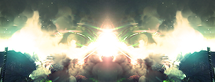
G.I.R. wrote:(The Halo 3 banner on the right is a faux-advertisement. =x And again, this is cropped.)
:|

@HP:
Poppy and childish? How so?
Image
I think Noobraska is a pretty cool state. eh grows corn and doesn't afraid of anythng.
(12:18:11 AM) GTAF: DAMNIT GIR WE ARE ON THE SUBJECT OF VINCE'S DICK.
User avatar
Lt Slap a ho


Grunge Critic Mad Hatter

Posts: 541
Joined: Sat Jun 10, 2006 6:34 pm

Post by Lt Slap a ho »

It looks much better with the green title. Great job, and keep working on it!
User avatar
SHOUTrvb


Socialist Snitch! Advisor Orb
Mad Hatter Connoisseur Pyre

Posts: 3934
Joined: Sun Feb 13, 2005 11:13 am
Contact:

Post by SHOUTrvb »

I guess no one catches my sarcasm anymore. :|
User avatar
G.I.R.


Recreator Coroner

Posts: 3221
Joined: Thu Aug 11, 2005 1:07 pm
Location: Missouri
Contact:

Post by G.I.R. »

SHOUTrvb wrote:I guess no one catches my sarcasm anymore. :|
The ':|' face usually does not denote sarcasm, therefore, I thought you were serious. :\

Anyway, what else should I do with this? I'm not really sure where to go from here.
Image
I think Noobraska is a pretty cool state. eh grows corn and doesn't afraid of anythng.
(12:18:11 AM) GTAF: DAMNIT GIR WE ARE ON THE SUBJECT OF VINCE'S DICK.
User avatar
SHOUTrvb


Socialist Snitch! Advisor Orb
Mad Hatter Connoisseur Pyre

Posts: 3934
Joined: Sun Feb 13, 2005 11:13 am
Contact:

Post by SHOUTrvb »

Well from way back, when I did actually do web design as a job, I would have never really gone for such a bulky layout. That's not a problem though. The layout has an alright simplistic look that will be a turn-on for certain viewers depending on who you're trying to draw to the site and what the site is for. You may want to stay away from such a warm tone with that text as well. More dark/light contrast would help. And since the layout suggest that the site will be a record label web-page, it might be a good idea to throw some music related shapes and such in there to spice it up. Maybe a music player showcasing client work if you have any clients. I also wouldn't go straight portal style. Left and right blocks are ok, but taking up the entire center with updates that may eventually stop coming is bad business. I'd keep only one news box, but have it archive every time a new article takes its place. From there, a few content blocks under the news block wouldn't hurt to allow more freedom. Don't forget copyright information. Also be sure to slice the site efficiently so that it works well with multiple resolutions. Those resolutions can be the biggest pain in the ass you'll ever experience in web design.
User avatar
HPDarkness


Socialist

Posts: 1925
Joined: Tue Mar 22, 2005 6:57 pm
Location: Boston
Contact:

Post by HPDarkness »

I don't know. It just seems like a site set more towards children, with all the greens and bubbly buttons. Eh, I'm not sure. Just keep at it, It looks good..
User avatar
Tural


Conceptionist Acolyte Bloodhound Recreator
Socialist Connoisseur Droplet Scorched Earth
Grunge

Posts: 15628
Joined: Thu Jun 16, 2005 3:44 pm
Location: Lincoln, NE
Contact:

Post by Tural »

I think it's the large, glossy sidebar navigation buttons with large text doing it.
Post Reply