Page 1 of 2
[Map Skin] DarkModders mainmenu - Loonycgb2{UPDATED}
Posted: Sun Oct 08, 2006 2:43 pm
by Loonycgb2
DarkModders Mainmenu
By: Loonycgb2

I may need some1 to get me a better halomods sign plz
Its a blackish mainmenu with all other features like words changed and etc.
Author: __.Loonycgb2
Website: _.http://trum0dd3rs.dyndns.org/
Preview: --.N/A
Patch:___-.
Patch Type: SPPF
Base: ___-.Mainmenu
Map Information:
[ YES ] __System Link
[ ] __BSP Mods
[ YES ] __Skin
[ ] __Model Injections
[ ] __Machines Added
[ ] __Biped Mods
[ ] __Vehicle Mods
[ ] __Weapon Mods
[ ] __AI Added
[ ] __Injected Scripts
[ ] __Teleporters Added
[ ] __Injected Sounds
[ YES ] __Lighting Mods
[ ] __Jmad Edits
[ ] __Physics Mods
Story:
Just a couple of mods their and some every wheree
Mods:
Its a blackish mainmenu with all other features like words changed and etc.
Screenshot 1:
Screenshot 2: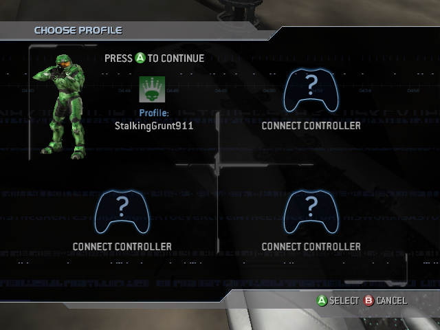 Screenshot 3:
 Screenshot 4:
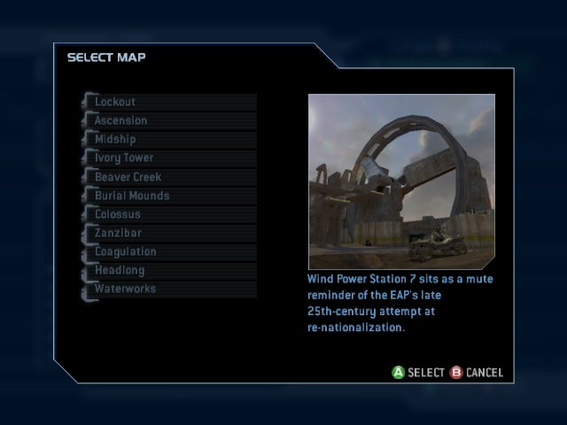 Screenshot 5:
 Screenshot 6:
 Credits:
PPF FuZe for his ideas for the mainmenu
Team Trum0dd3rs cause its my team
Voodoo for his html text box(thats all i copyed out of ur code)
This topic was auto generated with TruM0dd3rs Mod Post Generator
Posted: Sun Oct 08, 2006 2:45 pm
by Enlighten3d-one

yay halomods
i love halomods
kewl
Posted: Sun Oct 08, 2006 2:49 pm
by SpecOp44
Very nice. I might download it.
Posted: Sun Oct 08, 2006 2:51 pm
by GametagAeonFlux
It looks cool, but I don't really like how the Halomods logo looks on it...maybe mess with the colors a little?
Posted: Sun Oct 08, 2006 3:01 pm
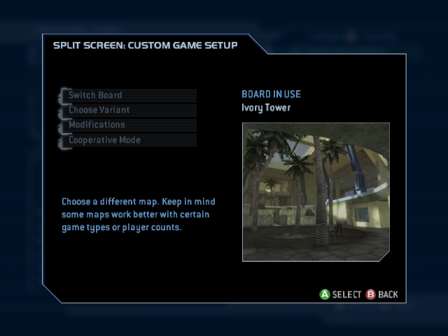
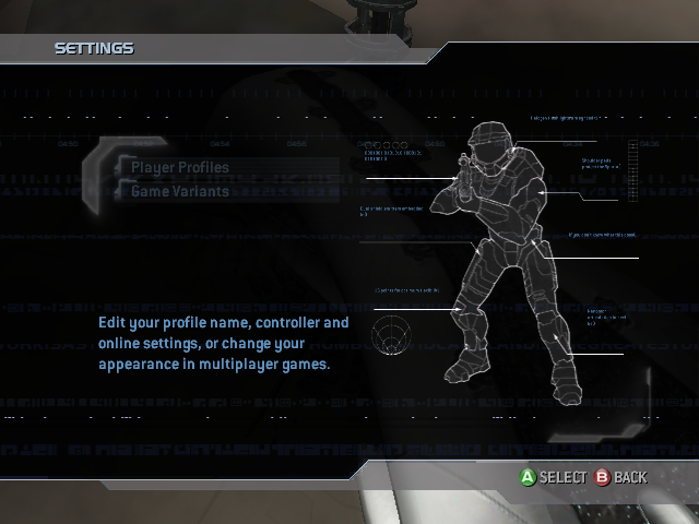
by StalkingGrunt911
GametagAeonFlux wrote:It looks cool, but I don't really like how the Halomods logo looks on it...maybe mess with the colors a little?
Posted: Sun Oct 08, 2006 3:02 pm
by G.I.R.
This should go in the H2 Skins section

Posted: Sun Oct 08, 2006 3:09 pm
by MrBalll
StalkingGrunt911 wrote:GametagAeonFlux wrote:It looks cool, but I don't really like how the Halomods logo looks on it...maybe mess with the colors a little?
Posted: Sun Oct 08, 2006 3:37 pm
by StalkingGrunt911
I saw that you needed pictures so I took some real quick. I am putting them in codes so just copy and paste them where you need to.
Code: Select all
[IMG]http://i83.photobucket.com/albums/j285/StalkingGrunt911/menu-2.png[/IMG]
Code: Select all
[IMG]http://i83.photobucket.com/albums/j285/StalkingGrunt911/menu-3.png[/IMG
Code: Select all
[IMG]http://i83.photobucket.com/albums/j285/StalkingGrunt911/menu-4.png[/IMG]
Code: Select all
[IMG]http://i83.photobucket.com/albums/j285/StalkingGrunt911/menu-5.png[/IMG]
Code: Select all
[IMG]http://i83.photobucket.com/albums/j285/StalkingGrunt911/menu-6.png[/IMG]
Code: Select all
[IMG]http://i83.photobucket.com/albums/j285/StalkingGrunt911/menu-7.png[/IMG]
Posted: Sun Oct 08, 2006 3:42 pm
by SpecOp44
The main picture is a .Gif showcasing 5 or 6 pics. He already has pics.

Re: [Map Skin] DarkModders mainmenu - Loonycgb2
Posted: Sun Oct 08, 2006 3:43 pm
by GametagAeonFlux
SpecOp, read:
Loonycgb2 wrote:Need pics if any1 can take them 4 me thx ill add to credits
Posted: Sun Oct 08, 2006 3:48 pm
by -DeToX-
1. i dont like how it says Halomods.
2. I dont like the renaming of the buttons you made.
3. I dont like how it says Made By: your name in red.
But i like the black. And the BSP and how its dark and not orange or filtered by blue.
Posted: Sun Oct 08, 2006 3:54 pm
by xheadshotmastax
StalkingGrunt911 wrote:GametagAeonFlux wrote:It looks cool, but I don't really like how the Halomods logo looks on it...maybe mess with the colors a little?
Re: [Map Skin] DarkModders mainmenu - Loonycgb2
Posted: Sun Oct 08, 2006 5:55 pm
by voodoo721
Good job sprucing up the post generator. Somethings could be fixed though.
Posted: Sun Oct 08, 2006 6:02 pm
by slayer410
-DeToX- wrote:But i like the black. And the BSP and how its dark and not orange or filtered by blue.
Posted: Sun Oct 08, 2006 6:04 pm
by CptnNsan0
the halomods logo looks a bit blurry. im guessing you just used the banner and thats why. but other than that not bad
Posted: Sun Oct 08, 2006 6:43 pm
by SingingBlaze
Hmm its ok but the Halomods logo as previously stated doesn't look too good the way you've done it.
Posted: Sun Oct 08, 2006 7:23 pm
by xXtR1Xm1Xx
I love the black.
Posted: Mon Oct 09, 2006 1:23 am
by Geo
Loving the black, remove the red text about who it was made by, rename those options so they're not as silly, and use this image

and -blam you got an awesome mainmenu...
or even this one;

Posted: Mon Oct 09, 2006 3:19 am
by StalkingGrunt911
Yes please try iGeo's text it looks alot better.
Re: [Map Skin] DarkModders mainmenu - Loonycgb2
Posted: Mon Oct 09, 2006 3:51 am
by SpecOp44
GametagAeonFlux wrote:SpecOp, read:
Loonycgb2 wrote:Need pics if any1 can take them 4 me thx ill add to credits
My bad...