Page 1 of 1
Environments, schmenvironments
Posted: Mon Jan 12, 2009 4:20 pm
by ScottyGEE
Why, hello!
I'll save you the lengthy paragraph that I normally write and say this:
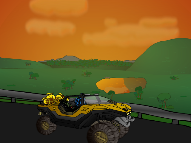
I suck at drawing environments. I thought I'd take another stab at it.
What's good?
What's bad?
How can I improve (without buying a tablet, mouse ftw

)?
Note: Don't bother with the foreground (ie, the warthog and its crappy blurred wheels)
Posted: Mon Jan 12, 2009 4:24 pm
by -DeToX-
I dislike the sky. The reflection looks off. The guard rail looks awkward to me. Try to give the road more detail.
That is all.
Posted: Mon Jan 12, 2009 4:27 pm
by ScottyGEE
Sky colour? It used to be blue. Thanks for the rest though.
Posted: Mon Jan 12, 2009 4:41 pm
by NotZachary82
That guard rail looks crooked ... and incomplete. The reflection also looks ... wrong. It's as if the massive hill is mirrored underneath, and the water is cutting a hole through the ground.
Posted: Mon Jan 12, 2009 5:13 pm
by Ombre
The clouds are the really bad part of the sky. They look blurry and just non-cloudlike. I like those trees though.
Posted: Mon Jan 12, 2009 5:36 pm
by WaeV
I like the hog and the color of the sky, but little else.
Posted: Mon Jan 12, 2009 6:00 pm
by RaVNzCRoFT
I don't like the warthog. The positioning and scale make it look strange, considering the guard rail only makes about a 15 degree angle of depression.
Posted: Mon Jan 12, 2009 6:12 pm
by ScottyGEE
I see now that it does look out of place. But I can't see how to fix it..? Larger and ;ess tilted?
Posted: Mon Jan 12, 2009 6:35 pm
by RaVNzCRoFT
The color gradient is pretty good, but the proportionality between the front and the back is what looks weird. I don't see any reason for the rear wheels to be any more than a tiny bit smaller than the front wheels.
Now that I think of it...the tilt of the actual frame is pretty good. It's really just the rear wheels that make it look bad.
Posted: Mon Jan 12, 2009 6:51 pm
by ScottyGEE
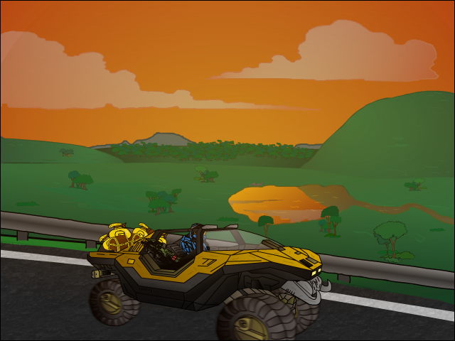
Hows this as an update?
As for the rear wheel thing, I have taken note of it. Its been on my mind fo awhile, but I don't know how to update it just yet. To me its passable
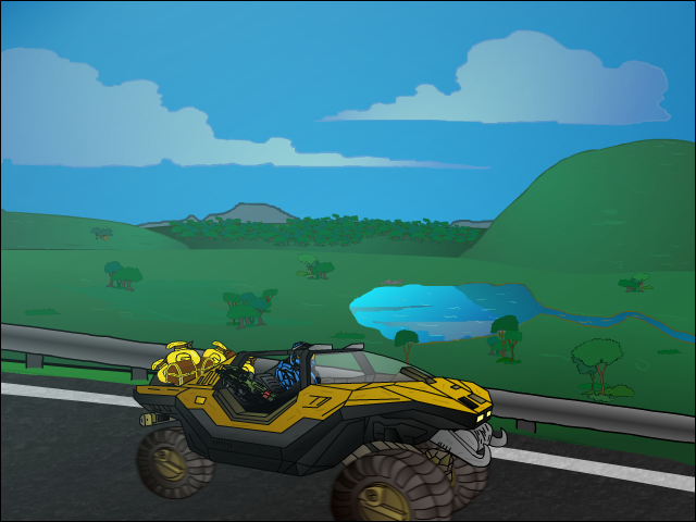
edit: Day time aswell.
Posted: Tue Jan 13, 2009 3:37 am
by xbox
Much better.
The perspective of the warthog looks off and it looks like you put a gaussian blur on the wheels rather than a motion blur.
Posted: Tue Jan 13, 2009 7:50 am
by Ketchup_Bomb
Is that treasure in the back seat?..
^^ Win.
Posted: Tue Jan 13, 2009 1:32 pm
by xbox
I noticed that, but didn't realize that it was actually treasure until you pointed it out.
Posted: Tue Jan 13, 2009 1:39 pm
by NotZachary82
It looks much better, but the reflection still seems to be off, IMO.
Posted: Tue Jan 13, 2009 3:55 pm
by ScottyGEE
Ketchup_Bomb wrote:Is that treasure in the back seat?..
^^ Win.
Most definately not!
>_>
<_<
Glad to know its now better

I'll fix up the wheels and tweak the reflection but I don't think I'll post updates on it...They're mostly minor things.
Posted: Wed Jan 14, 2009 3:09 pm
by INSANEdrive
Work on the Shading, but overall a good start, you almost look like you know what your doing.
