Page 1 of 1
Cool thing
Posted: Sat Mar 08, 2008 2:43 pm
by Cobain
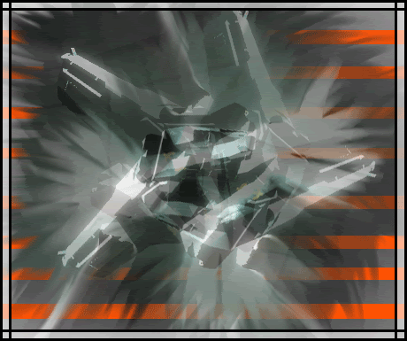
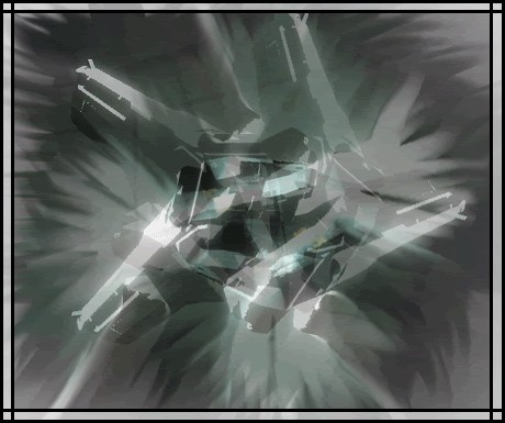
yeah... i worked on this for a wile...
[/code]
Posted: Sat Mar 08, 2008 3:22 pm
by Darkness202
i like the second one better the first one's orange distracts you from the focal point i like it though 8/10
Posted: Sat Mar 08, 2008 3:30 pm
by Loor
Nah. I like the first one better. The orage stripes gives some colour and life to it.
Posted: Sat Mar 08, 2008 3:38 pm
by preston566
I like'em both. But, are they abstract? I can't tell what it is.
Posted: Sat Mar 08, 2008 8:12 pm
by MoDFox
I don't like either, they're busy and messy.