Page 1 of 2
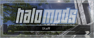
Clean Halomods Staff Signatures. [Update: PSD Download]
Posted: Tue Sep 18, 2007 3:57 pm
by JacksonCougAr
[Clean Halomods Staff Signatures]
[V1]: Simply two uses of the "PrtSc" button and some cropping/cloning.
 [v2]
[v2]: Added a stroke
 [v3]
[v3]: Swapped the border and inner colours.
 [v4]
[v4]: Because apparently 'clean' is out...
 [v5]
[v5]: Make glass effect more 'frosty'...
 [v6]
[v6]: Lots of stuff... Mainly reduced height. Rounded corners = fail...
 [v7]
[v7]: Opacity changed on Halomods logo.
 [PSD File Download]
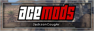
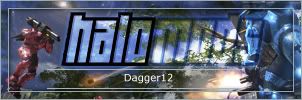
 [User Permutations]
[JacksonCougAr]
[Dagger12]
Posted: Tue Sep 18, 2007 3:58 pm
by CabooseJr
I see no use for this.
Posted: Tue Sep 18, 2007 3:59 pm
by GametagAeonFlux
Too simple. I dislike it.
Posted: Tue Sep 18, 2007 4:00 pm
by CabooseJr
V2 breaks the sig rules.
Posted: Tue Sep 18, 2007 4:02 pm
by JacksonCougAr
How so...?
Oh... yea... :p
Posted: Tue Sep 18, 2007 4:03 pm
by Tural
Height.
Posted: Tue Sep 18, 2007 4:23 pm
by youhoo7
i dont like it
Posted: Tue Sep 18, 2007 4:28 pm
by Halo4Ever
I'd say its different from what I normally see here, but I don't like it, the fact that you used plain to impress us and not complicated I think it was a decent idea, but I still don't like it.
Posted: Tue Sep 18, 2007 4:59 pm
by Kirk
I actually like them, but I don't see myself ever using one.
Posted: Tue Sep 18, 2007 5:10 pm
by Halo4Ever
Kirk wrote:I actually like them, but I don't see myself ever using one.
Your signature is good enough already, Plain, but straight out there, If you had a image people might not be to interested in the text

Posted: Tue Sep 18, 2007 5:14 pm
by JacksonCougAr
Funny... We had a funny encounter over the rules described in his sig, and how he 'forgot' about them, lol...
Posted: Tue Sep 18, 2007 5:16 pm
by SHOUTrvb
Taking on some sycophantic ways there Jackson? But yet, and bit too clean for my liking.
Posted: Tue Sep 18, 2007 5:42 pm
by JacksonCougAr
bootlicking: attempting to win favor from influential people by flattery
No... I don't think I am. i was going to make a "member" version, but then I didn't think it would be worth my time changing the text...
Posted: Tue Sep 18, 2007 6:22 pm
by -Legendary-
The messy versions are pretty cool.
Posted: Tue Sep 18, 2007 6:46 pm
by StalkingGrunt911
I don't see any of the staff members using this anytime soon, I think the Staff thing under their name is good enough, and I'm sure they like their current signatures (or avatar <3 SGEE). I do think that v4 and v5 do look nice.

Posted: Tue Sep 18, 2007 6:47 pm
by newbymodder
lol jackson i guess not huh haha we just talked about this on kia
Posted: Tue Sep 18, 2007 6:55 pm
by GametagAeonFlux
V4 and V5 are a step in the right direction. ;p
Posted: Tue Sep 18, 2007 7:05 pm
by ScottyGEE
Make 5 have rounded glass edges on the inside. Maybe a bit smaller in height (100) and I'll consider it

Posted: Tue Sep 18, 2007 8:25 pm
by JacksonCougAr
Updates, Main thread.
Posted: Tue Sep 18, 2007 8:53 pm
by ScottyGEE
Giving it a whirl...Does it make my bum look fat?