
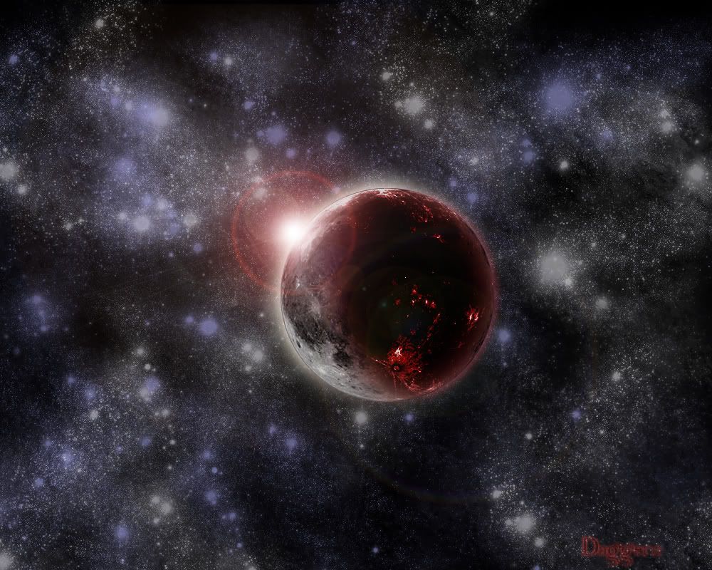
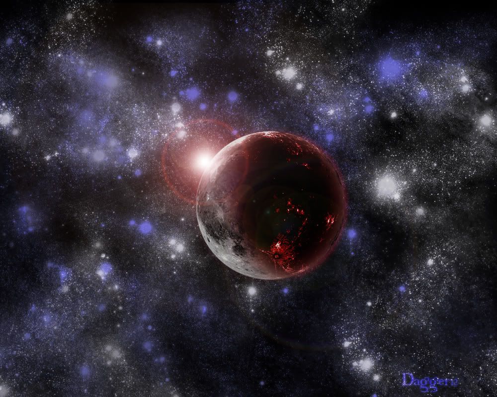
Bloody Moon i used a TUT
 (An Old one.)


The background seems dull, and there's too many brighter stars. And there seems to be a hard line around the planet (you can see it where the sun shines on it the most). And, the change from the normal moon to the bloody part of it seems a little abrupt. You should try to make it a little more gradual. Also, in the top left hand corner of the image, I can see clearly that you clone brushed it by the repeditive-ness of the star cluster. Try to hide that a little bit.
Other than that, it's good.
7/10
Other than that, it's good.
7/10


-
reanimation-06

- Posts: 388
- Joined: Mon Mar 19, 2007 2:49 pm
- Location: Middle of nowhere...

-
Alexei

- Posts: 164
- Joined: Tue Feb 15, 2005 1:05 am
- Location: Behind you holding a sharp sword
- Contact:
|
|
|
well
for a TUT image its more than passable
but u have to remember that starts are distant suns, here they look brushed on. they dont have solid white in the middle like a star would.
and its abit overkill with the stars too imho. lower the number, increase the brightness. and maybe decrease the size some and itll be much better


![[x]](http://img255.imageshack.us/img255/3713/fearck7.jpg)
![[x]](http://img246.imageshack.us/img246/8220/rb6vzo3.jpg)
![[x]](http://img504.imageshack.us/img504/7088/bustawolfrb3.jpg)