
Yea uh this isn't very hardcore but i like how it came out.
http://jacksonsalt.deviantart.com/art/S ... y-62695414
Make sure you full view.
And i painted in photoshop 7 no refrences used.
Simple

-
DarkShallFall

- Posts: 1992
- Joined: Fri Jan 20, 2006 2:49 pm
- Location: MI, USA
- Contact:
|
|
|
|
|
|
|
|
|
|
|
|
|
|
|
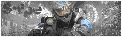


I really don't like this piece, and i'll tell you why.
When you do something like this, you can't miss any detail in the actual subject, because thats what's taking all the focus of the person viewing the artwork. I don't know what it looked like before you saved it as a jpeg, but it looks like what alexander said, you saved it at a 1/12 compression, making it look REALLY bad. And even though you were going for the "Simple" effect, the main item has to be at least a little bigger than that. I think you ought to put a border on it as well, because the off-white clashes terribly with the deviantart light blue.
When you do something like this, you can't miss any detail in the actual subject, because thats what's taking all the focus of the person viewing the artwork. I don't know what it looked like before you saved it as a jpeg, but it looks like what alexander said, you saved it at a 1/12 compression, making it look REALLY bad. And even though you were going for the "Simple" effect, the main item has to be at least a little bigger than that. I think you ought to put a border on it as well, because the off-white clashes terribly with the deviantart light blue.
