Page 1 of 1
Do you like? I used no render.
Posted: Thu Dec 15, 2005 12:42 pm
by lxNicktardxl
I thought about it and realized, I dont ALWAYS need a stupid render. So hows this?
Square Vs. Circle.


Posted: Thu Dec 15, 2005 1:38 pm
by halobuddha
looks ok but i like ur current 1 better
Posted: Thu Dec 15, 2005 4:19 pm
by wes
the bottom one has a line sticking out of it
Posted: Thu Dec 15, 2005 4:22 pm
by lxNicktardxl
Ok....That is a minor problem, please tell me if you like it and which one?
Posted: Thu Dec 15, 2005 4:22 pm
by kickflip42
ur rite but not many people will notice, well they might i didnt at first.
Posted: Thu Dec 15, 2005 4:53 pm
by lxNicktardxl
lxNicktardxl wrote:please tell me if you like it and which one?
Come on! I really could care less about that line.
Posted: Thu Dec 15, 2005 4:54 pm
by wes
top one, but the text on both is a little pixely
Posted: Thu Dec 15, 2005 5:16 pm
by Cuda
I like the text background is kinda awkward, but a border would be nice.
Posted: Thu Dec 15, 2005 5:36 pm
by halobuddha
top 1
Posted: Thu Dec 15, 2005 5:45 pm
by RaVNzCRoFT
I like the top one, except it needs a border, the text is looking kind of pixelated, and I don't like that line that cuts through it just above the text.
Posted: Thu Dec 15, 2005 5:57 pm
by lxNicktardxl
Thanx. What kind of border? I a really am no good with borders.
Posted: Thu Dec 15, 2005 6:12 pm
by RaVNzCRoFT
The square one could use a 2 pixel black border, since it has darker colors and black is harder to see on dark colors. If the signature was yellow, only a 1 pixel black border would be necessary.
Posted: Thu Dec 15, 2005 7:29 pm
by Cuda
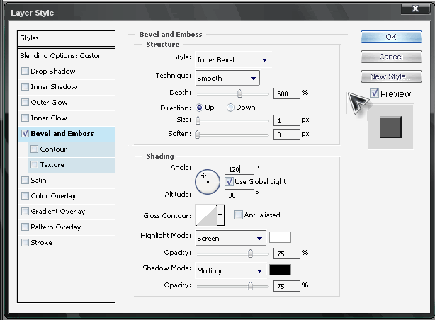
lxNicktardxl wrote:Thanx. What kind of border? I a really am no good with borders.
try a B&E border like mine. set it to this.