Page 1 of 1
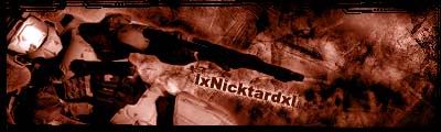
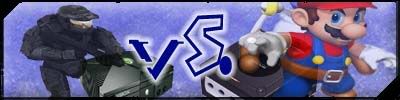
2 New Sigs, what do you think?
Posted: Wed Nov 23, 2005 12:02 pm
by lxNicktardxl
Posted: Wed Nov 23, 2005 1:02 pm
by Cuda
the second one is my favorite.
Posted: Wed Nov 23, 2005 3:52 pm
by wes
i think the borders are too thick
Posted: Wed Nov 23, 2005 3:55 pm
by lxNicktardxl
When they are smaller I cant notice them. I know they are big though.
Also...
Where and how do I get cool fonts for Photoshop CS2?
Posted: Wed Nov 23, 2005 3:58 pm
by wes
www.dafont.com/en
go there, download fonts, put the font files in C: Drive, Windows, Fonts
Posted: Wed Nov 23, 2005 4:03 pm
by Dr.Cox
it looks like ur squishing ur renders

Posted: Wed Nov 23, 2005 4:05 pm
by lxNicktardxl
I copy them, erase the background then transfer them to the sig, then trasform (scale).
???
Posted: Wed Nov 23, 2005 4:07 pm
by Dr.Cox
lxNicktardxl wrote:I copy them, erase the background then transfer them to the sig, then trasform (scale).
???
well ur 2rd one looks distorted and squished
Posted: Wed Nov 23, 2005 5:54 pm
by hogmaster77
wes wrote:www.dafont.com/en
go there, download fonts, put the font files in C: Drive, Windows, Fonts
or you can go to fonts in the control panel
that way the fonts are recognized in ms word and other applications and you dont get an error
Posted: Wed Nov 23, 2005 6:14 pm
by lxNicktardxl
They worked in Photoshop fine.

Posted: Thu Nov 24, 2005 9:54 am
by hogmaster77
why are some of them squashed?