Page 1 of 1
The Shadows
Posted: Fri Nov 04, 2005 7:27 pm
by jks
Im really rather pleased with this ones results. Text is the best in any sig Ive done, do you think I should current it?
Posted: Fri Nov 04, 2005 7:28 pm
by JK-47
another great sig jks
Posted: Fri Nov 04, 2005 7:40 pm
by hogmaster77
totally make it ur current
ur back in ur groove I guess
the zoom is nice too
Posted: Fri Nov 04, 2005 7:55 pm
by jks
Thanks.
Posted: Fri Nov 04, 2005 7:58 pm
by VoYdE
looks sweet
Posted: Fri Nov 04, 2005 8:37 pm
by Cuda
I like the Magneto one better, but this ones still good.
Posted: Fri Nov 04, 2005 8:57 pm
by maca_§
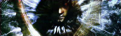
I'd say get rid of the red dot (his eye?) and it'd be 10/10.
Posted: Fri Nov 04, 2005 11:16 pm
by jks
Thats supposed to be the point of contrast, between the light background and him, obviously hes the shadow.
Posted: Fri Nov 04, 2005 11:33 pm
by wes
multi-genre wrote:another great sig jks
Posted: Fri Nov 04, 2005 11:39 pm
by jks
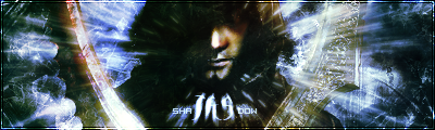
I made some changes, happy maca?
EDIT: ZOMG!!! TEH CRAP SIG!!! Never do this at home kids:
Posted: Sat Nov 05, 2005 1:23 am
by maca_§
I'm never happy.....But it's better

!
Haha.
Posted: Sat Nov 05, 2005 4:41 am
by RaVNzCRoFT
Amazing. At first sight, the red dot for his eye looked kind of cool. But after a few seconds of looking at the signature, it started to just like weird. lol
Posted: Sat Nov 05, 2005 8:29 am
by wes
[quote="maca_